Linear's issue detail panel: how an empty screen teaches density
A teardown of Linear's issue detail panel, covering the information hierarchy, whitespace logic, state transitions, and micro-interactions behind one of SaaS's most deliberately restrained screens.

Open a Linear issue. The first thing you notice is how much nothing there is.
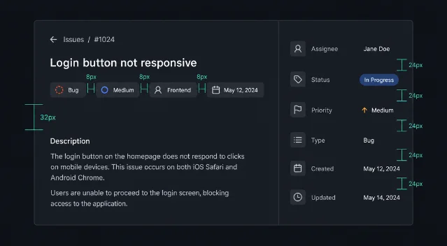
No floating action buttons. No sidebar widgets competing for your eye. No color-coded priority flags screaming at you from three directions at once. Just a large, quiet title field, a thin strip of status metadata, and a description box waiting to be filled.
This restraint is a design argument — one that's been made carefully, field by field.
Information hierarchy: the title does almost all the work
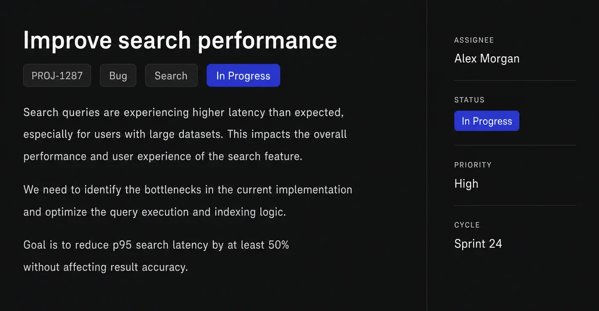
Linear's issue detail panel divides into two columns: a wide content area on the left, a narrow properties rail on the right. The split is roughly 70/30 — but the visual weight is closer to 90/10.
The title field dominates. It's rendered at roughly 24–28px, no bold, no color. Linear bets that the title — not the status badge, not the assignee chip — is the thing you came to read. This is a deliberate inversion of Jira's model, where a cluttered toolbar and a status banner fight for first attention before you can read the issue name.
Below the title, there's a single row of property chips: Status, Priority, Assignee, Cycle, Label. Each chip is small — around 12px text — and monochromatic against the dark background. When nothing is set, they render as muted placeholders. When set, they go slightly brighter but never shout. The hierarchy is clear: the title tells you what the issue is; the chips tell you where it lives.
The right rail — the properties sidebar — carries the same information redundantly for quick scanning. It exists for a different reading posture: someone skimming a list of issues, glancing right to catch status without reading the title. The duplication is intentional and serves two real use cases from one layout.
Whitespace: gaps as grammar
Most product teams treat whitespace as whatever's left after you place all the elements. Linear treats it as a primary design decision.
The description area below the title has roughly 32px of vertical padding before content begins. That gap isn't decorative — it creates a perceptual boundary between the issue's identity (title + chips) and its content (body). When the description is empty, the gap reads as invitation. When it's full, it prevents the body from visually collapsing into the header.
The property chips in the top row have equal horizontal spacing — approximately 8px between each chip. This regularity does two things: it prevents any single property from appearing more important than the others (Linear's philosophy is that status, assignee, and priority are peers, not ranked), and it makes the row scannable as a unit rather than a list.
The right rail uses consistent 24px vertical spacing between each property group. This is standard 8-point grid discipline, but what's notable is that Linear doesn't break this rhythm for "important" properties. No larger gap before the Assignee field, no tighter spacing for less-used fields. Uniform rhythm keeps the sidebar from becoming a place where visual emphasis misleads you.
State changes: surfaces that respond without interrupting
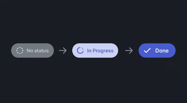
Linear's issue detail is a live document. Status, assignee, and priority update in real time across team members. The design problem is: how do you show change without turning a focused work surface into an activity feed?
Status transitions are the most visible state change. When you click the status chip and select a new state, the chip animates through a short cross-fade — roughly 150ms — with no layout shift. The text changes in place. There's no toast notification, no confirmation modal, no success banner. The change just happens, and the chip's new label is the only evidence.
This is a deliberate bet on keyboard-first users. Linear's
T shortcut opens a context menu for status without leaving the keyboard. The change confirmation is the visual update itself. For a PM running a standup while updating issues in real time, this is the right trade-off.Subtask completion shows a more nuanced state model. When all subtasks are checked, the parent issue doesn't auto-close — it just shows a quiet "all complete" indicator next to the subtask count. Linear's model keeps the PM in control of final state transitions while still giving a useful signal, avoiding the false automation where completion silently propagates from child to parent.
Comment loading on long threads uses a progressive reveal with a "Load earlier comments" anchor rather than infinite scroll. You always see the most recent exchange first; historical thread is opt-in. The visual treatment of that anchor — small, low-contrast, placed at the top of the comment block — reinforces its secondary status.
Micro-interactions: the 150ms decisions
The smallest design choices in Linear are also the most opinionated.
Hover states on property chips show a subtle background fill — no border, no underline, just a barely-perceptible lightening of the chip's background. The radius matches the chip's pill shape exactly. This micro-interaction does one job: it tells you the chip is clickable without adding visual noise at rest.
The
? shortcut opens a full keyboard shortcut map as an overlay. The overlay uses the same dark surface as the rest of the app, blurs the background content, and appears with a 200ms ease-in. What matters is what happens when you close it: the background de-blurs at the same speed, returning to the previous state without a jarring snap. The symmetry signals that this is a peek — not a modal, not a new page.Inline editing on the description field has no edit button and no save confirmation. Click, type, blur. Content saves silently. Linear applies this contract across all text fields in the issue detail. The only feedback is the absence of feedback — no spinner, no checkmark. Trust is embedded in the model.
Drag handles on subtasks appear on hover as a six-dot grip icon, offset about 16px from the text. At rest, the subtask list looks static. On hover of any row, the grip appears just for that row — not the whole list. This keeps the interface quiet at rest and responsive to intent.
The underlying principle
Every decision in Linear's issue detail panel serves one constraint: minimize the distance between intent and action for a keyboard-fluent user. The large title, the chip row, the silent saves, the hover-only affordances — all of them assume that the person using this screen knows what they want and shouldn't have to navigate visual noise to get there.
Jira can always add another field. Linear's challenge is maintaining a surface that a PM can open 30 times a day without developing interface fatigue. The empty space isn't a failure to fill the screen. It's the product.
Follow along in your own workspace: linear.app
围绕这条内容继续补充观点或上下文。